WEBSITE REDESIGN | UI/UX | WEB CODE
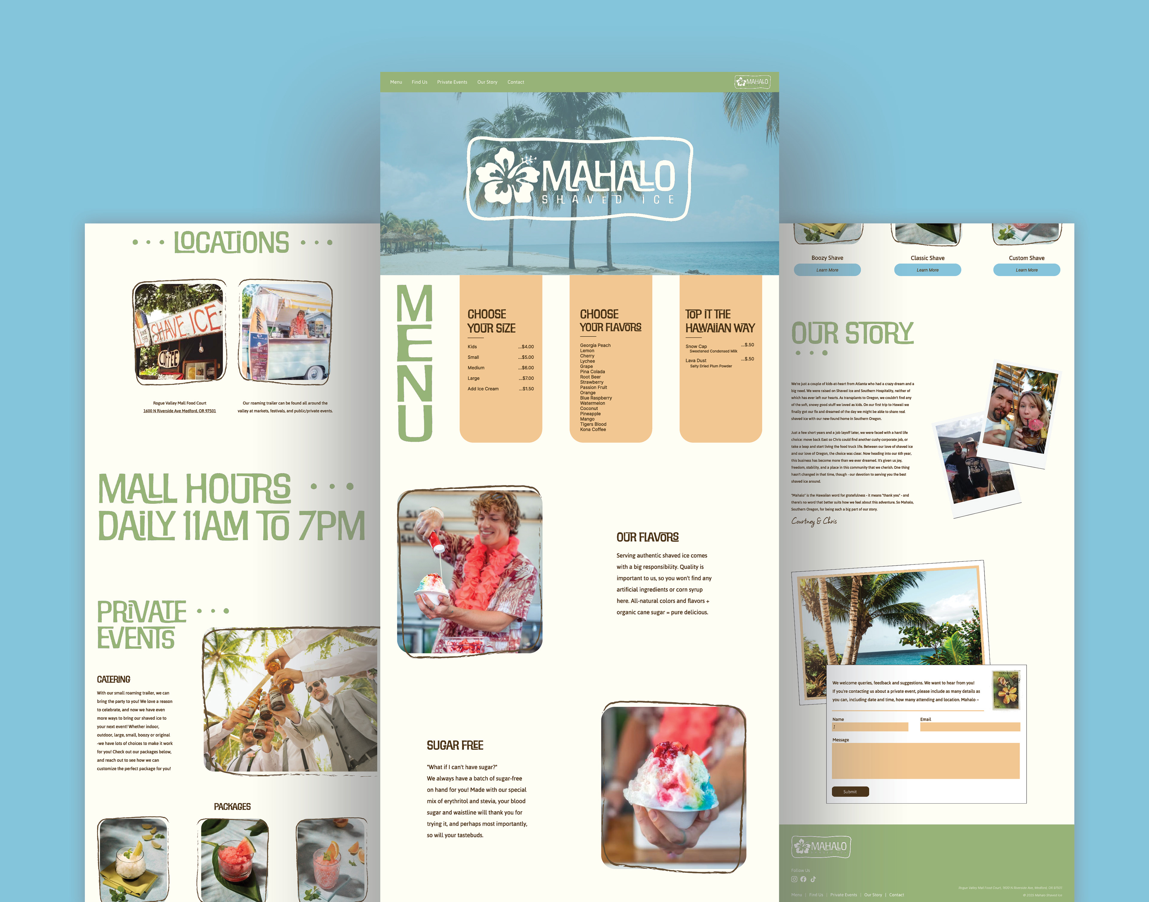
Mahalo Hawaiian Shaved Ice is a small business rooted in the vibrant spirit of island culture. This project focused on redesigning the existing website to improve both visual consistency and user experience while preserving the brand’s colorful, aloha inspired identity.
I reimagined the brand and digital experience from the ground up, including a refreshed logo, updated color palette, and cohesive typography system. The website was designed in Figma through wireframes and interactive prototypes, then
fully developed using Adobe Dreamweaver. The final site features clearly structured sections for menu offerings, locations, private events, brand story, and contact, with a responsive layout optimized for desktop, tablet, and mobile. Performance and accessibility were evaluated using industry tools, with improvements made to loading speed, code quality, and responsiveness to create a more functional and
user-friendly experience.
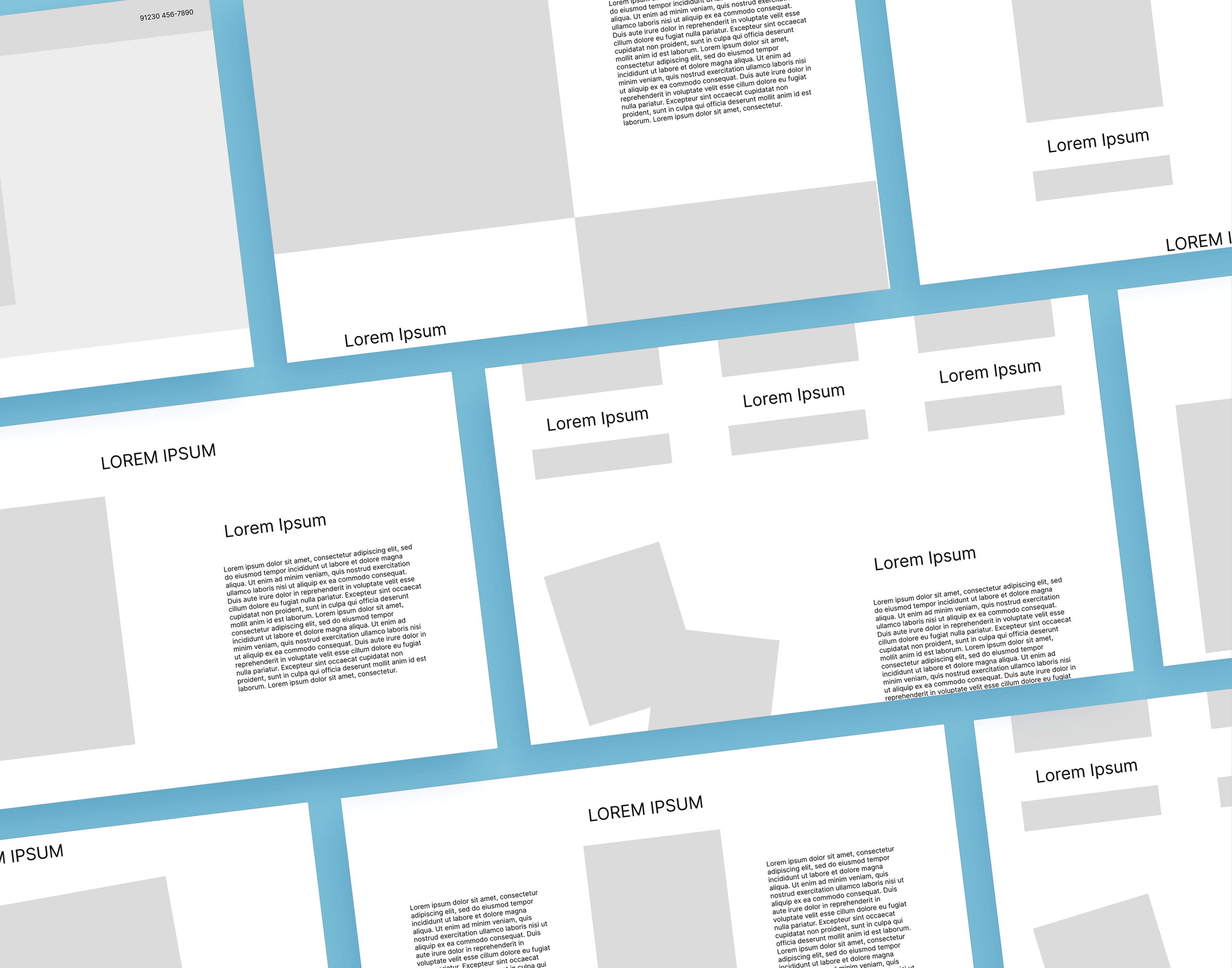
Wireframes
PrototypeS
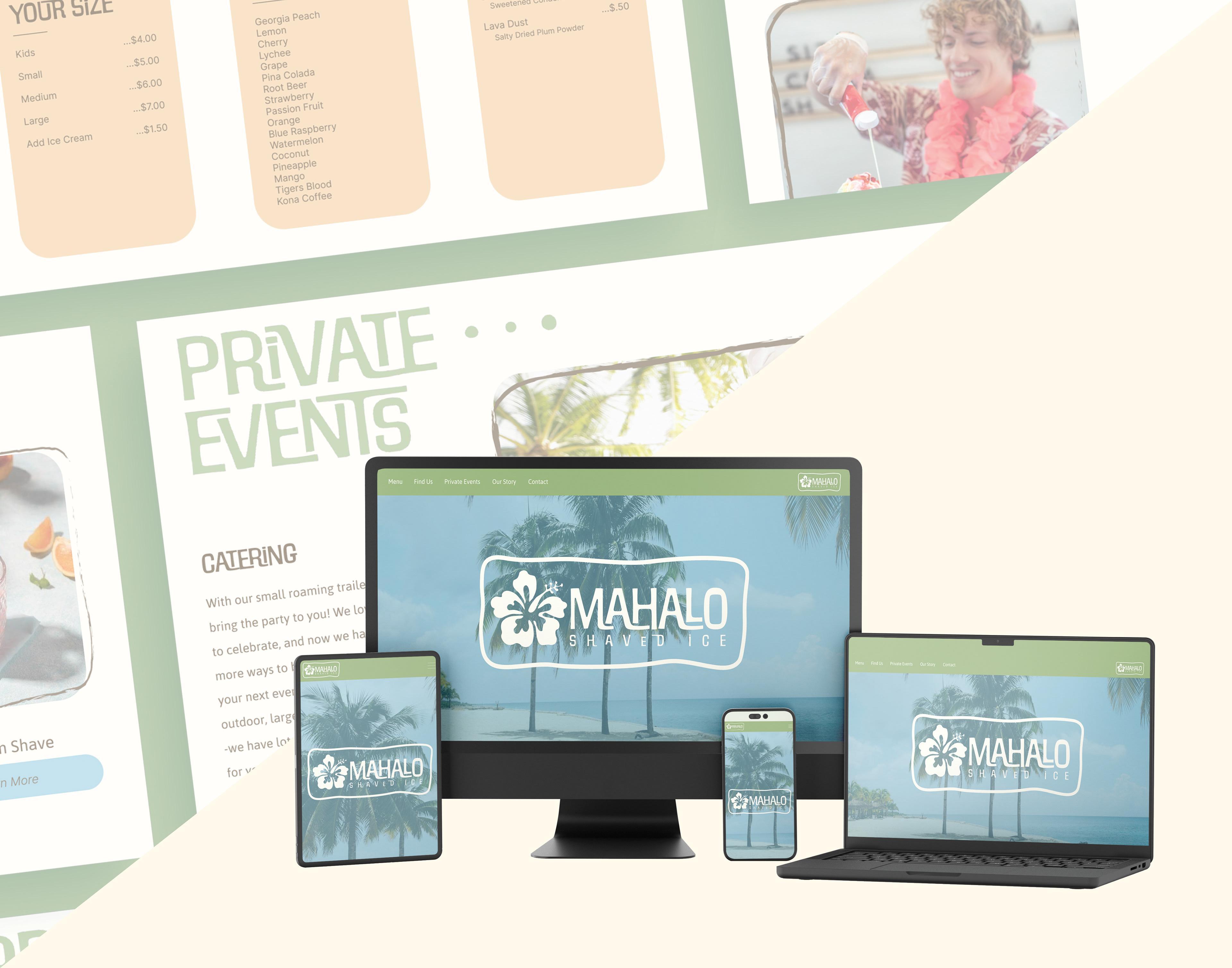
Responsiveness testing
To evaluate my website’s performance, I used several tools. On Pingdom, my site scored a B (83) with a fast load time of 708ms. It suggested reducing HTTP requests to improve performance. Nibbler gave me a score of 39
and highlighted areas like low text volume (due to the one-page layout) and image optimization. I resized and compressed images in Photoshop to improve load speed. At the time of testing, the site wasn’t mobile-optimized,
but I’ve since added responsive code. I also ran the site through W3 Validator, which helped me fix minor HTML errors like adding a lang attribute. Using Chrome’s Lighthouse tool, I scored an 81 in performance, 75 in accessibility and best practices, and 91 in SEO. These tools taught me that optimizing a site goes beyond visuals. It’s about performance, accessibility, and precise coding.